Monday, 21 February 2011
How effective is the combination of your main product and your ancillary texts?
I believe that the visual links found between the website, digi-pak and music video are a key element in our project. We wanted to make the connection clear between all of the products so that our target audience could easily associate them at first glance. To achieve this, we decided a common theme would be necessary throughout the ancillary texts. For example using similar imagery to that used in the video, the front and back design of the digi-pak as well as on the background of the website we were able to add consistency.
We felt that it was most important to create a visual link or theme between our three ancillary products. This way, our audience would connect with all three and would be able to categorize them (as well as the video itself) as a whole unit of products. We were encouraged to achieve this, not only from researching artists and their products, but from our focus groups during our primary research. A lot of people who we asked said that a successful artist or band should create a clear yet stylish link between all of their products.
Although a poster was not created, we believed that the music video would be sufficient enough to penetrate directly into it's target audience. This is why we decided to follow the theme with imagery directly taken out of our music video. The images featuring the horse and master, make up a relatively large segment of the overall music video and therefore will easily be seen as a key part of the product in the minds of the audiences. The idea is that through seeing the music video on television on mainstream channels such as MTV, consumers will be able to make a clear link when they see the digi-pak. Where the music video will target new fans as well as loyal fans, the reason behind the website containing the image of the horse are to promote the new album to already existing fans in case they miss the music video and simply investigate the website.
We based our digi-pak design not only on the footage from the music video but we were also inspired by the research we conducted into Snow Patrol's real album designs. We found out that none of their album covers actually showed the band themselves which made our process easier as we only showed the 'lead singer' in our production and did not equate for a band to be created. By taking a still picture and spending time in IPhoto (a programme ran through Mac computers) editing and adjusting the contrast, light intensity and colour density, we were able to create the perfect picture for our media ancillary texts.
Overall I believe the combination of our main product and ancillary tasks was very successful. The reason for this being due to the fact we made a strong visual link which would enable instant recognition to any fans interesting in the band and it's products, as well as looking professional and appealing to the eye.
In what ways does your media product, develop or challenge forms and conventions of real media products?
I feel that our music video, from the research and planning to the finished product, both challenges and develops the conventions that are used in real media products today. When starting this project, we had studied media theorist, Andrew Goodwin. According to him, there are seven key features that a music video must try to achieve. Through careful consideration we adapted nearly each of the conventions and included aspects of them in our music video. Firstly there is genre characteristics. This, I believe, is clearly demonstrated throughout the design, our chosen themes and our actual music video. The alternative indie productions produced by Snow Patrol, and similar bands such as The Wombats, The Kooks and Arctic Monkeys, are often made through visually artistic concept combined with performance imagery which is what we felt was important to achieve.
The link between the music and the visuals we found was far more important for our production. The slow pace of the music meant that cuts had to be perfectly timed and changes in clips had to be carefully selected, selecting a creative range, so that the audience did not get bored whilst watching the video. I believe that the editing and shot length and arrangement was well suited to the song that we chose, and that it was much harder to achieve than it would be with a fast paced song.
The notion of looking put forward by Goodwin is a convention that is massively exploited over many genres in the music industry, especially the R&B and Rap genres. However we questioned weather this was necessary in our production, as we did not intend to represent the women as a sex object. Laura Mulvey, media theorist has explored and developed the Male Gaze theory. She believes women in the media are seen strongly, through the eyes of men, as sex objects. We did not want to reflect this image of the females used in our music video as it did not suit the context of the lyrics or themes of the song. We used symbolic references to replace what would be the woman role in our video. The black horse shown being led through a field and eventually running freely is there to resemble the woman in the failed relationship. We felt a horse was appropriate because they are strong, elegant and proud creatures which represented the new found strength and freedom of the female.
Intertextual content, the last of Goodwins points we conformed to, consists of a media product linking to several other media types (internet, film, radio etc). Although this was not a main focus point of our finished product we have included some inter-textual content which is also symbolic to our chosen song. We have included a scene where a ring on a gold chain is thrown into a pond, which of course is meant to mimic the scene from Titanic, where Rose throws the Jewel into the ocean. The use of the burning letters is also a clear link to the romance film The Notebook where Allie’s mother keeps letters sent to her from her partner because she believes he is not suitable for her.
By conducting both primary and secondary research on specifically chosen audiences, we were able to follows the conventions of the genre and style of song we chose. Not only researching the band themselves, but by conducting focus groups with various age groups revealed who Snow Patrol's main audiences were and because of this, we were able to select some ideas that the groups put forward. This was a key into the development of the video as it allowed us to combine conventions and styles that Snow Patrol use, with what the audience wanted to see.
Overall, using Goodwin's theory as an indicator of a real media music videos, it is clear that whilst our production does meet the majority of conventions commonly found in our chosen genre, we have also developed certain conventions to suit the demands required by our particular song. We also challenged some conventions which are often seen in real life media productions. For example by de-sexualising the women in our video, instead of showing her in a provocative light.
Sunday, 20 February 2011
What have you learnt from your audience feedback?
Audience feedback has played a vital part throughout the construction and development of our entire project, and has enabled us to editing and make small but important changes to our music video. As soon as we had chosen our song to do our music video on, we selected focus group from around our school and asked them to fill in a questionnaire on what images and themes came to mind when listening to our song. We were surprises that many candidates put forward many of the same ideas which were almost all symbolic or concept.
This first stage was important as we learnt what the audience wanted, and who the audiences were.
Secondly we created our video to what we believed would satisfy our target audiences as we had merged their ideas which would fit with the song, with the conventions that are commonly associated with Snow Patrol's music.
Another way we used audience feedback was after we had finished editing for the first time. We showed our music video to a small group of people to gain some feedback on where we could improve on. One of the most common pieces of feedback was that our editing was slightly to slow in pace, even though we used a slow song, they suggest we interject more short artistic shots. As well as that, they said to make sure our lip sinking was completely in time. Using this feedback, we took increased the pace slightly and scrupulously analysed the lip-syncing. After these changes had been made we took advantage of various platforms such as Facebook and YouTube, but also confronted the same focus group as well as a few more. We learnt from this that the changes had made a great difference to the video as the majority of the audience no longer found the footage boring or generic but instead enjoyed watching the whole thing. We also learnt that the deep level of symbolism used in our concepts may have been to complex for some of the audience as we received various comments asking things like 'what was the horse for' and 'why was it in a barn'. We learnt that although the footage was not bad quality, some of the implied meanings within were hard to decode without the summary provided on the blog, and next time we would make them slightly less intense.
Some of the feedback included how well the lip-syncing was as some people mistook Ben for the singing and the more artistic shots. The more negative comments were ‘What was the horse for?’ and ‘Why was it in a barn?’ This showed us maybe our symbols were slightly too deep without the explanation of the blog and we should have made them more explicit with there connotations in the film. Next time, we would make the meanings more outspoken and obviously to the younger target audiences.
Mrs K Moore, (a teacher at Hannah's mum's work said: "I thoroughly enjoyed watching the video. The theme was clearly evident throughout and the hcoice of the two locations successfully represented the emotional turmoil of the two characters. The open space suggested a long ing for freedom,whilst the enclosed, grey dance space gave the illusion of being trapped. The tethered horse used in the first frame gave the impression of being trapped whilst the shot used later when the horse is loose, represents freedom. The choice of a dark, miserable, rainy day also helped to symbolise the breakdown of the relationship as the raindrops represented tears shed. I suggest that you use a few additional close up artistic, to reiterate and emphasise the symbols you have already used."
How did you use media technologies in your construction, research, planning and evaluation stages?
During the construction of my music video and my ancillary tasks, I used many different media technologies to achieve the finished products.
When researching and planning, I used several different media platforms to gain the research I needed to gain a deeper understanding about our target audiences and the industry on the whole. The first media technology we used, was the Internet. Using various websites such as Wikipedia, news sites and record companies sites I was able to discover more about Snow Patrol. Analysing the band's real website and others from a similar genre allowed me to discover specific criteria that makes a successful site! Wikipedia was extremely useful when trying to find out information about the music industry and how it has changed and developed over the years.
The other media technology we used was word programs combined with printing devices. This was so that we could mass produce questionnaires to give to several focus groups of different ages. This primary research was the most important as it outlined trends in demographics and helped us to establish who our target market were, which then allowed us to filter out the relevant ideas put forward by these individuals.
Once we had captured the footage we needed we used I-movie which was can be found on any apple mac laptop. Having access to I-movie meant we had a much wider range of editing choices than if we used a similar competitor such as windows movie maker or others. We were able to add various transitions which made our production flow smoothly and look realistic.
Since we used Macs on our project last year, we were aware on how to use the programming. However, for our ancillary tasks editing the photo was a new experience. Using IPhoto to edit the photo for our album cover and website, allowed us to do so with such precision meaning we got the outcome that we had longed for.
Social networking sites were valuable ways of including media technologies into the construction and receiving feedback of our music video. Yahoo Answers was very useful in gathering answers and advice on topics during the production of our music video. Facebook, today’s biggest and most interactive networking site played a vital role in getting feedback from viewers of our video. We found that the majority of comments we gained from uploading our video onto Facebook were from people who fitted the expected demographic.
Friday, 18 February 2011
Connotations Within Our Music Video
Connotation: An idea or meaning suggested by or associated with a word or a thing.
Within our music video there are several intertexual references to films etc, and also a lot of connotations or 'hidden' meanings which may not be clear or obvious at first but when explained, hopefully brings the whole video to life and give it deeper meaning. Whilst planning and actually making our music video, nothing was done at random or by 'coincidence' - everything was specifically chosen, decided upon and put into place.
After deciding on our concept idea and what we hoped to portray from our music video, we chose the location to film on. Again, this was not random or the convenient place out of our options, we chose our location based on what would fit our concepts accordingly. The symbolism of having our dancers performing in a barn was to emphasise the 'destruction' or 'unkempt' situation the failing relationship made the female feel like she was in. There was no life or anything vibrant or inviting about the barn therefore it represented the dying and eventually dead relationship which is being sung about. Although the relationship is over and there are no pleasant feelings in the matter, we did not interpret the song to be at all filled with anger or resentment. The barn also helps to get this vital point across. If we wanted to reflect emotions of severe pain, anger or hatred, we would have re thought our choice of location and gone for something a little more aggressive looking or include features such as fire or weapons.
The next connotation or subtle meaning created and included in our music video was the choice of make-up and costume for the dancers. The most noticeable aspect of the make-up was the white face which contrasted against the black clothing. The pale, almost hidden, face represented how drained the relationship had left the female. It also creates a clear link to mimes because of the similar white faces. A mime could be said to be 'acting', 'faking emotion' or even 'lifeless'. This was appropriate in portraying the female within the song as it could be suggested that she was 'acting' out happiness towards the end of the relationship until she couldn't pretend any longer. The costume choice was specifically picked to emphasise the concepts within our music video as well as being inspired by the clothing in HURTS' video - Wonderful Life. The black clothing was a symbolism for the bleak and gloomy feelings reflected in the song. The netting included on the head decoration which, when positioned correctly, covered part of the face was showing how the female was hidden and felt 'trapped' behind her relationship.
The decision to use a horse was to represent the woman in stead of using a female actress. A horse is associated with beauty, elegance, pride and independent - all qualities which can be said about a woman. The way in which the horse is being 'led' around the field shows how the female was 'trapped' and possibly 'controlled' in her relationship and eventually the horse is set free to run to her future which is a symbol of her new found freedom and independence being broken away from her partner. The fact that the horse is not shown in light of harm, distress or punishment re visits the idea that the relationship is not depicted as violent or nasty.
Our 'filler' shots consisted of letters being burned, a ring being discarded of and a dried dead rose being crushed. Each of these represent memories the couple in the song had together and having them being 'gotten rid of' emphasises that the bond between them is over and gone and both partners are able to move on and create new memories with new people.
Thursday, 17 February 2011
Filming Day 3
Today's shoot was to primarily to film the horse (filler) shots. I collected the horse we chose to work with from the field and we groomed her for around half an hour. This not only made her appear clean and smarter for camera but it also got her used to our voices and kept her calm. I feel like today was a great success, especially since the weather was perfect. Not only did we film the horse, but we also managed to get the album cover photo


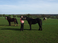
Filming the horse took time and patience but we began be following a similar filming pattern to the previous two days. Therefore we set up a range of shots where the horse would by led in a continuous 'S' letter shape in front of the camera, this would create angle range and different perspectives on the horse. We continued this, walking the horse from a distance up close to the camera, and filmed each sequence so it was accompanied by a different back ground view. This gave us range when it came to editing.


From previous planning, we has established that shots of the horse being 'led' around the field by a person (me) and finally shots of her galloping through a filed would look great and would fit into our concept style and meanings that had been implemented in the rest of the video. The reason for picking a horse, firstly walking around and finally running freely, was to symbolise the woman being 'trapped' in her relationship and eventually 'breaking free' from the relationship.
Obviously when working with any animal additional safety precautions had to be taken. The sheer size of the horse alone was a danger in itself meaning we needed someone who knew something about the animals and someone who the horse was comfortable to work with.


Taking the still shots, which we would use for our digipak cover, we decided that the main feature should be the leader and a horse. We took many shots from different distances and with various scenery to review and pick the best at a later date. The imagery again was linked to our video as the same female is shown walking the horse as on the images. This not only gives the audience the impression that the single which would be on the album is a more well known song, and would create recognition when buying or watching the video as the two products can be linked easily.

Monday, 14 February 2011
Filming Day 2
We had arranged at the end of our first filming day that we would meet again to film the other main section of our music video on the following weekend (12th February). We arrived at the farm about 12:30pm, again a dull, wet day with very strong wind. Hannah and Beth (our two dancers) stayed in the car to put on their make up and finishing touches to the costumes, this was to mainly avoid the weather. Matt Lauren and myself set up the barn by moving the gates, to create enough space for Hannah and Beth to dance in, and sweeping the area of hay and removing any unwanted objects.


An important element of the day was providing 'warming' breaks for the dancers. As we filmed in February, the temperature was not pleasant to be exposed in, and with the thin outfits we chose to use, it was important that the dancers did not become too cold and risk their own health. To counter this effect we provided blankets and additional layers, which we gave to them after every completed shot of the dance sequence.


As with the other half of the filming we decided to film the dance from many different angles to ensure footage was not scarce and we have a choice of what to edit, where to cut and to allow the desired outcome to be as closely achieved as possible.The dance was choreographed well in advance to ensure the day ran as smooth as possible. We began by shooting the dance from a standard mid length straight on angle and soon moved on more creative shots such as having the dance going on 'around' the camera and extreme close ups of particular body parts (to exaggerate certain dance moves)


Tuesday, 8 February 2011
Filming Day 1
From producing our filming time schedule sheet, we began the first bit of our filming of the 5th February 2011. We had decided that it would be best to focus on both elements of the music video individually so that we could focus on each one separately to ensure quality was as good as possible. The other reason for doing this was to make sure that our actors and helpers were not wasting their kindly donated time by standing around aimlessly, and becoming de-motivated.

On the first day (5th Feb) we focused heavily on filming the miming, or 'singing', section of the video. The weather was not good in the morning at about 9:00am so we agreed to wait until 11:00am to see if the weather had improved or at least the rain had stopped. The weather conditions had not changed by 11:15am but we still arranged to meet at 11:30am (our set time) at our location - Acton Trussell farm. When we arrived at our location, we double checked our required equipment list (this allowed one of us to drive home to get anything if we'd forgotten it) and began to carry the equipment (camera, tripod and lighting) to the Oak tree where we would be filming this section of the music video.

In order to get enough footage, we filmed Ben (our male lead), miming the entire song, in sections, from many different angles: straight on (mid, close ups and extreme close up), from above and below, over the shoulder etc). By doing this it gave us a wide range of footage to play around with and use when we came to edit our project. As well as giving us a variety of creative shots to consider, it also meant that if any shots were not suitable (out of time lip syncing, objects in shots, marks on the camera lens) we had enough footage of each shot so we could ensure that at least one of the shots was usable when editing.
We shared duty's throughout the day and tried to rotate and be fair when allocating. The main jobs we divided out where of course filming, along with lighting, lighting aids (reflectors, filters) and 'water control', which meant keeping equipment dry, as well as the actor and lens of the camera so that the footage was not ruined with unwanted rain marks on the lens.
Sunday, 23 January 2011
Call Sheet
What Is A Call Sheet?
A call sheet is a chart issued to the cast and crew of a theatrical or film production, listing the production schedule (times, dates, places etc). Typically, in addition to including a schedule, the call sheet also includes a list of contact information for other members of the cast and crew, this would benefit the whole production in case of an emergency because it would save time trying to find people - the call sheet would provide the whereabouts of everybody involved and the times.
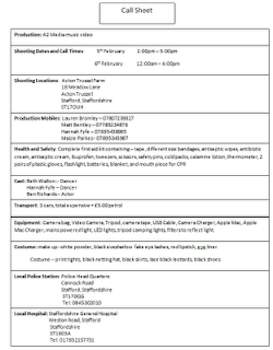
Our Call Sheet
We decided a call sheet for filming was going to be extremely useful for the days we were planning to film on. The sheet we prepared and distributed to everybody involved in our project is shown to the right.
We also knew from our AS production that call sheets also contain other useful information such as contact details such as mobile numbers, emails, as well as script pages. We also found out that advanced call sheets often contain details on weather, locations of local hospitals, sunset/sunrise times and locations of local hardware stores! They commonly have information on transport details, which is vital to ensure everyone is were they need to be.
Risk Assessment Form
What Is A Risk Assessment Form?
A Risk Assessment is a systematic method of looking at professional work activities, considering what could go wrong, and deciding on suitable control measures to prevent loss, damage or injury in the workplace. The assessment form should include the controls required to eliminate, reduce or minimise the risks.
 We thought it was very important to assess the risk involved with our filming location and any equipment as it was vital to be prepared for every stage of planning and filming.
This allowed the filming to run smoothly and allowed the group to work knowing what and where potential risks would be on the set of filming.
Our risk assessment form is shown to the left and was distributed to each person involved in the production of our music video.
A Risk Assessment is a systematic method of looking at professional work activities, considering what could go wrong, and deciding on suitable control measures to prevent loss, damage or injury in the workplace. The assessment form should include the controls required to eliminate, reduce or minimise the risks.

This allowed the filming to run smoothly and allowed the group to work knowing what and where potential risks would be on the set of filming.
Our risk assessment form is shown to the left and was distributed to each person involved in the production of our music video.
Saturday, 22 January 2011
Equipment/ Prop List
Equipment/ People List
- 1 camera
- 1 tripod
- 1 extension cables
- 1 Mac Book (for editing)
- 1 music player (so miming and dancing can be done in time)- 2 gold light filters
- 1 car (for transport as well as a potential lighting source)
- torches and umbrellas
- waterproofs (to wear whilst not filming in case of rain)
- 1 camera (to take still shots)
- 1 leadrope (for handling the horse)
- 2 dancers (both female - to represent the male and female roles)
- 1 male actor (to mime the lyrics)
- 1 driver (to transport)
- 1 camera man/woman
- 1 lighting man/woman- 1 horse
- food/drink
Costume List
Dancers
- 2 black leotards
- 2 small clip on top hats
- 2 pairs of black tights
- 2 black skirts
- 2 pairs of black shoes
- facial make-up
Male actor
- 1 black suit
- 1 white shirt
- 1 pair of black shoes
Friday, 21 January 2011
Our Costume
We went shopping to Primark in Hanley to pick up the features we required for our final costume idea. Here are some of the pieces we picked up before bringing the whole outfit together finished


Our Finished Costume Design

Thursday, 20 January 2011
Final Costume Idea
Having considered various ideas for our dancers' and singers' costume, we have brought our preferred ideas together, creating a final costume design. We were inspired heavily by the contemporary band HURTS and how they use the dancers and costume in their videos to create mood and atmosphere. In particular, the HURTS video Wonderful Life caught our eye whilst exploring existing music videos and the use of costumes. The video is shown below:
From the video, you can see predominantly the use of black clothing which is what we discussed in our initial ideas stage. The gloomy colouring in the sky, clothing, building all helps to create a very effective mood on the whole performance.

The picture to the right was taken from the Vogue Magazine website within the 'Looklet' section where anyone can 'create looks' by dragging items of clothing onto a model on the screen. An online user of this website has created this look based on the HURTS video - Wonderful Life and the costumes used in that. We were immediately interested in looking at the clothing this person has chosen up close because the video does not reflect the individual clothing in detail or clearly.
 The use of the thin netting on the neck area, as opposed to revealing flesh, is something we will use in our costume because it draws away from the women being looked at as 'sexual'. This also applies to the use of tights on the models legs. The bow tie suggests an almost masculine appearance as is cuts the necks natural elegant length. We will not be using heals for our final costume simply because it will interfere with the fluency of the dance and movement.
The close up image to the right nicely shows the facial and head decorations. This persons interpretation of the HURTS video has included a type of small hat with netting attached to it. The use of the head decoration distracts away from the females hair which is usually styled to look very feminine and sexy in music videos. It, again, revisits the idea of portraying the female dancers in a masculine light.
We have used all these features to come up with our own costume design. Including our final make-up idea we have designed a whole styled look which we believe will reflect
the meaning and connotations within our ideas
for the music video.
 |
| Looklet - Vogue Magazine |

The picture to the right was taken from the Vogue Magazine website within the 'Looklet' section where anyone can 'create looks' by dragging items of clothing onto a model on the screen. An online user of this website has created this look based on the HURTS video - Wonderful Life and the costumes used in that. We were immediately interested in looking at the clothing this person has chosen up close because the video does not reflect the individual clothing in detail or clearly.
 The use of the thin netting on the neck area, as opposed to revealing flesh, is something we will use in our costume because it draws away from the women being looked at as 'sexual'. This also applies to the use of tights on the models legs. The bow tie suggests an almost masculine appearance as is cuts the necks natural elegant length. We will not be using heals for our final costume simply because it will interfere with the fluency of the dance and movement.
 The close up image to the right nicely shows the facial and head decorations. This persons interpretation of the HURTS video has included a type of small hat with netting attached to it. The use of the head decoration distracts away from the females hair which is usually styled to look very feminine and sexy in music videos. It, again, revisits the idea of portraying the female dancers in a masculine light.
We have used all these features to come up with our own costume design. Including our final make-up idea we have designed a whole styled look which we believe will reflect
the meaning and connotations within our ideas
for the music video.
Tuesday, 18 January 2011
Final Make-up Idea
Film Reference
 In order to develop our make-up design and perfect it to the standard we wished it to be, my group and myself researched and studied many concept music videos which included dramatic make-up and also looked at many films. A new film being advertised around this time was 'Black Swan', a ballet based film which tells the story of Swan Lake using humans (dancers). From adverts, we noticed how intense and powerful the use of facial make-up is and how is draws you, as the audience, in.
 As shown by the picture, the visual impact this style of make-up has on a viewer is very gripping and almost intimidating. There is a great contrast between the pale, ghostly face and the shockingly detailed black eye make-up, it creates a slightly scary appearance. We have practised the use of white powder on the dancers' face's and the effect is very dramatic and what we were imagining when the idea first came to mind. The white, washed out face symbolises We will also use a bright lip colour so they don't get lost amongst the heavy use of colours. Overall I am extremely pleased with our final make-up idea because we are now able to use it to explain some of the connotations and hidden messages/ meaning throughout the video.
 In order to develop our make-up design and perfect it to the standard we wished it to be, my group and myself researched and studied many concept music videos which included dramatic make-up and also looked at many films. A new film being advertised around this time was 'Black Swan', a ballet based film which tells the story of Swan Lake using humans (dancers). From adverts, we noticed how intense and powerful the use of facial make-up is and how is draws you, as the audience, in.
Final Digipak Design
We wanted to continue a theme of visual image recognition throughout our music video and ancillary products (website, poster, digipak etc). This would make our bands style and image link together and be easily recognised by audiences who are exposed to their products. Below are two picture. One showing our design for the front cover and one for the back cover of our digipak.


Colour scheme
The colouring of the pictures was created by changing the contrast and lighting, using iPhoto, to give the images a golden tint and give the scene a warmer feel. We decided to do this because it also gives the image a surreal look, and further enhances the idea that the image has deeper implications and symbolic content.
Titles and headings
Images


Colour scheme
The colouring of the pictures was created by changing the contrast and lighting, using iPhoto, to give the images a golden tint and give the scene a warmer feel. We decided to do this because it also gives the image a surreal look, and further enhances the idea that the image has deeper implications and symbolic content.
Titles and headings
The titles shown on the edge of the horizon, contrasts well against the sky making it easy to see by consumers. The font we chose took some time to choose, as it was important not to make the text look tacky or out of place. For this reason we used smooth text which made the writing easy to read and look 'classy' and professional to the eye.
On the back of the album cover the text shown is in the same font, however is much smaller as more information needs to be displayed. The text is in symmetrical positions in list form on the exterior to make it easier to read for the audience.
Images
We decided to use the images of the horse and the girl again as they are a memorable part of our music video, and probably the most symbolic! The horse is symbolic for the women in the relationship as it represents beauty rather than sexuality which is what we deliberately wanted to avoid, hence the use of a horse. We did not want Laura Mulvey's male gaze theory to come into practice when consumers thought of our video and when looking for our album.
Due to the pictures importance, we decided to display two variations of the same theme, on the front and back of the digipak cover. Similarly to the website design we used a continuous theme across all three of the platforms to help create a connection between all three of our media products.
Monday, 17 January 2011
Final Website
Our website
When designing and creating our website, we obviously wanted to make it look as professional as possible.By using a free online website maker, we were able to adapt and create our own template, meaning that we were not restricted when it came to making the site how we wanted. We referred back to our answers from questions we asked and research to figure out what we would require to include on our website to make it a success and appear professional looking.
Web address: http://www.ignitedantesinferno.moonfruit.com/
Name (web address)
The domain name is of course the name of the band that we chose as well as the name chosen for the album combined. The idea behind this is to act as more of a promotional tool for their new album release. Of course fans would be redirected from the normal fan site if this was of course real.
Colours
The colour scheme, although not entirely to the conventions of the standard Indie/Alternative genre's website, flows well against the backdrop which is again a promotional tool in which the album cover is shown clearly behind any text boxes. The text box's follow a continuous theme which consist of using a black background tinted with a dark green border, which combines our natural theme to match the album cover as well as meeting some conventions of real band sites of a similar genre.
The text we used was mostly to tell fans about the band, giving quirky facts such as how they got their name, how long they have been formed and additional information about the album. To give a more credible, as well as personal touch to the website, we often used quotations designed to be from the lead singer. This is commonly seen on real band websites, as it lets the audience receive a deeper link with the artists.
Images
The images we used mainly show concerts that are supposed to be the band live. However we also created a sample picture of a limited edition album pack which contained several vinyls as well as DVD content, and a poster. The idea was again to promote the album's release as in the real music industry promotion is key to sales.
Pages
When creating the site we decided to make several different pages that fans could access. They are as follows;

Home - It is important to have a home page which fans will be taken to once they enter the website. This of course is to make them feel comfortable that they are in the correct place, and gives general information of the new album release, upcoming news and offers that they can receive!
Bio - The bio for the band gives additional, more detailed information about how the band formed, where they formed and of course, following the promotional theme, information on the release of the new album. It is designed to give its fan base a better understanding of how the band work, and make them feel almost as if they know them personally!
Pictures - Of course this is simply a gallery to display new images of the band and their recent activities simply to give the audiences something interesting to look at. Also by showing pictures of live performances which look vibrant and exciting Ignite are more likely to increase sales of their live tour in the music industry. By allowing a comment box below, fans are able to voice their opinions of photographs and give them the feeling that they are involved and are being heard by the band as well as other fans!
Interviews - The interview section is designed to be a constant feed which shows interviews as they happen, thus replacing the previous post. We have designed an interview with the music company, MTV, which with its name alone adds credibility t the interview as the business is so well established within the music industry. The interview is designed to achieve similar objectives as the bio page, and gives additional information to its audience but in a slightly different format.
Contact us - This really only acts as a support page for fans. It allows visitors of the site to email the band with their thoughts, feelings and support and in the music industry it would increase not only credibility of the website, but make fans feel valued. customer service is essential in any industry, however in this situation the product is the band and the bands music.
Pitch
Initial idea
Our initial idea was to create a narrative music video which told the story of a couple who's relationship failed due to the main actor being hit by a car. However we decided against this as we would find it hard to make the video a professional standard which would mimic the conventions found in the industry.
Target audience
After resesrching into our target market we did primary research such as questionaires, focus groups and asked questions online which allowed us to find out that our target market was primarily an older audience with younger audiences not showing much interest in the genre of music. This is what made our group decide to change from a narrative to a concept video. This was due to older generations having more interest in this style of genre (alternative/indie). We also tried to incorporate intertextual references to further entice our targeted audiences. Our main concepts came from a combination of our primary research and they consisted of the use of an oak tree, a barn and a field with a horse.
Inspiration
We got a lot of our inspiration from the musical group ''Hurts''. The ballet style outfits as well as the contempory dance moves fitted in well with our chosen genre and song. The Oscar winning movion picture ''Black Swan'' was the main inspiration behind our make up designs and final choices. This was because we wanted a bold image that not only represented our concepts but stood out on the camera and looks elegant.
Final idea
For our final idea we finally decided to combine a concept video with a performance style. We selected and used several key elements for our music video which were the use of the barn, the oak tree and the field with the horse. We also incorporated a dance which was symbolic of the womens role in the relationship.
Saturday, 15 January 2011
Planning Our Pitch

Our pitch will be crafted and performed in order to explain to our audience why we were doing what we're doing and to make any concepts what could be questioned clear. To make our pitch as clear as possible we wanted to plan it carefully before hand in order to be certain that it will be understood by viewers. We intend to describe our plan and how we have developed our ideas to fit audience expectations and elements often used in the specific genre.
1) Original ideas - ideas and reasons for discarding them
2) Target audience - market research, primary and secondary
3) Inspiration - similar genre styles
4) Our final idea - what, why and how
Subscribe to:
Posts (Atom)