Sunday 23 January 2011

Call Sheet

What Is A Call Sheet?
call sheet is a chart issued to the cast and crew of a theatrical or film production, listing the production schedule (times, dates, places etc). Typically, in addition to including a schedule, the call sheet also includes a list of contact information for other members of the cast and crew, this would benefit the whole production in case of an emergency because it would save time trying to find people - the call sheet would provide the whereabouts of everybody involved and the times. 
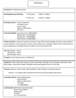


Our Call Sheet
We decided a call sheet for filming was going to be extremely useful for the days we were planning to film on. The sheet we prepared and distributed to everybody involved in our project is shown to the right.
 
We also knew from our AS production that call sheets also contain other useful information such as contact details such as mobile numbers, emails, as well as script pages. We also found out that advanced call sheets often contain details on weather, locations of local hospitals, sunset/sunrise times and locations of local hardware stores! They commonly have information on transport details, which is vital to ensure everyone is were they need to be.

Risk Assessment Form

What Is A Risk Assessment Form?
A Risk Assessment is a systematic method of looking at professional work activities, considering what could go wrong, and deciding on suitable control measures to prevent loss, damage or injury in the workplace. The assessment form should include the controls required to eliminate, reduce or minimise the risks.


We thought it was very important to assess the risk involved with our filming location and any equipment as it was vital to be prepared for every stage of planning and filming. 
This allowed the filming to run smoothly and allowed the group to work knowing what and where potential risks would be on the set of filming.
Our risk assessment form is shown to the left and was distributed to each person involved in the production of our music video.

Saturday 22 January 2011

Equipment/ Prop List

Equipment/ People List
- 1 camera
- 1 tripod
- 1 extension cables
- 1 Mac Book (for editing)
- 1 music player (so miming and dancing can be done in time)- 2 gold light filters
- 1 car (for transport as well as a potential lighting source)
- torches and umbrellas
- waterproofs (to wear whilst not filming in case of rain)
- 1 camera (to take still shots)
- 1 leadrope (for handling the horse)


- 2 dancers (both female - to represent the male and female roles)
- 1 male actor (to mime the lyrics)
- 1 driver (to transport)
- 1 camera man/woman
- 1 lighting man/woman- 1 horse
- food/drink

Costume List


Dancers
- 2 black leotards
- 2 small clip on top hats
- 2 pairs of black tights
- 2 black skirts
- 2 pairs of black shoes
- facial make-up


Male actor
- 1 black suit
- 1 white shirt
- 1 pair of black shoes

Friday 21 January 2011

Our Costume

We went shopping to Primark in Hanley to pick up the features we required for our final costume idea. Here are some of the pieces we picked up before bringing the whole outfit together finished


Our Finished Costume Design


Thursday 20 January 2011

Final Costume Idea

Having considered various ideas for our dancers' and singers' costume, we have brought our preferred ideas together, creating a final costume design. We were inspired heavily by the contemporary band HURTS and how they use the dancers and costume in their videos to create mood and atmosphere. In particular, the HURTS video Wonderful Life caught our eye whilst exploring existing music videos and the use of costumes. The video is shown below: 


Looklet - Vogue Magazine
From the video, you can see predominantly the use of black clothing which is what we discussed in our initial ideas stage. The gloomy colouring in the sky, clothing, building all helps to create a very effective mood on the whole performance. 


The picture to the right was taken from the Vogue Magazine website within the 'Looklet' section where anyone can 'create looks' by dragging items of clothing onto a model on the screen. An online user of this website has created this look based on the HURTS video - Wonderful Life and the costumes used in that. We were immediately interested in looking at the clothing this person has chosen up close because the video does not reflect the individual clothing in detail or clearly. 
The use of the thin netting on the neck area, as opposed to revealing flesh, is something we will use in our costume because it draws away from the women being looked at as 'sexual'. This also applies to the use of tights on the models legs. The bow tie suggests an almost masculine appearance as is cuts the necks natural elegant length. We will not be using heals for our final costume simply because it will interfere with the fluency of the dance and movement. 
The close up image to the right nicely shows the facial and head decorations. This persons interpretation of the HURTS video has included a type of small hat with netting attached to it. The use of the head decoration distracts away from the females hair which is usually styled to look very feminine and sexy in music videos. It, again, revisits the idea of portraying the female dancers in a masculine light. 
We have used all these features to come up with our own costume design. Including our final make-up idea we have designed a whole styled look which we believe will reflect 
the meaning and connotations within our ideas 
for the music video. 

Tuesday 18 January 2011

Final Make-up Idea

Film Reference
In order to develop our make-up design and perfect it to the standard we wished it to be, my group and myself researched and studied many concept music videos which included dramatic make-up and also looked at many films. A new film being advertised around this time was 'Black Swan', a ballet based film which tells the story of Swan Lake using humans (dancers). From adverts, we noticed how intense and powerful the use of facial make-up is and how is draws you, as the audience, in.

As shown by the picture, the visual impact this style of make-up has on a viewer is very gripping and almost intimidating. There is a great contrast between the pale, ghostly face and the shockingly detailed black eye make-up, it creates a slightly scary appearance. We have practised the use of white powder on the dancers' face's and the effect is very dramatic and what we were imagining when the idea first came to mind. The white, washed out face symbolises We will also use a bright lip colour so they don't get lost amongst the heavy use of colours. Overall I am extremely pleased with our final make-up idea because we are now able to use it to explain some of the connotations and hidden messages/ meaning throughout the video.

Final Digipak Design

We wanted to continue a theme of visual image recognition throughout our music video and ancillary products (website, poster, digipak etc). This would make our bands style and image link together and be easily recognised by audiences who are exposed to their products. Below are two picture. One showing our design for the front cover and one for the back cover of our digipak. 


Colour scheme
The colouring of the pictures was created by changing the contrast and lighting, using iPhoto, to give the images a golden tint and give the scene a warmer feel. We decided to do this because it also gives the image a surreal look, and further enhances the idea that the image has deeper implications and symbolic content.

Titles and headings 

The titles shown on the edge of the horizon, contrasts well against the sky making it easy to see by consumers. The font we chose took some time to choose, as it was important not to make the text look tacky or out of place. For this reason we used smooth text which made the writing easy to read and look 'classy' and professional to the eye.
On the back of the album cover the text shown is in the same font, however is much smaller as more information needs to be displayed. The text is in symmetrical positions in list form on the exterior to make it easier to read for the audience.


Images
We decided to use the images of the horse and the girl again as they are a memorable part of our music video, and probably the most symbolic! The horse is symbolic for the women in the relationship as it represents beauty rather than sexuality which is what we deliberately wanted to avoid, hence the use of a horse. We did not want Laura Mulvey's male gaze theory to come into practice when consumers thought of our video and when looking for our album.
Due to the pictures importance, we decided to display two variations of the same theme, on the front and back of the digipak cover. Similarly to the website design we used a continuous theme across all three of the platforms to help create a connection between all three of our media products.

Monday 17 January 2011

Final Website

Our website

When designing and creating our website, we obviously wanted to make it look as professional as possible.By using a free online website maker, we were able to adapt and create our own template, meaning that we were not restricted when it came to making the site how we wanted. We referred back to our answers from questions we asked and research to figure out what we would require to include on our website to make it a success and appear professional looking.  


Web address: http://www.ignitedantesinferno.moonfruit.com/

Name (web address) 
The domain name is of course the name of the band that we chose as well as the name chosen for the album combined. The idea behind this is to act as more of a promotional tool for their new album release. Of course fans would be redirected from the normal fan site if this was of course real.

Colours 

The colour scheme, although not entirely to the conventions of the standard Indie/Alternative genre's website, flows well against the backdrop which is again a promotional tool in which the album cover is shown clearly behind any text boxesThe text box's follow a continuous theme which consist of using a black background tinted with a dark green border, which combines our natural theme to match the album cover as well as meeting some conventions of real band sites of a similar genre.

Text 
The text we used was mostly to tell fans about the band, giving quirky facts such as how they got their name, how long they have been formed and additional information about the album. To give a more credible, as well as personal touch to the website, we often used quotations designed to be from the lead singer. This is commonly seen on real band websites, as it lets the audience receive a deeper link with the artists.

Images 
The images we used mainly show concerts that are supposed to be the band live. However we also created a sample picture of a limited edition album pack which contained several vinyls as well as DVD content, and a poster. The idea was again to promote the album's release as in the real music industry promotion is key to sales.

Pages
When creating the site we decided to make several different pages that fans could access. They are as follows;


Home - It is important to have a home page which fans will be taken to once they enter the website. This of course is to make them feel comfortable that they are in the correct place, and gives general information of the new album release, upcoming news and offers that they can receive!

Bio - The bio for the band gives additional, more detailed information about how the band formed, where they formed and of course, following the promotional theme, information on the release of the new album. It is designed to give its fan base a better understanding of how the band work, and make them feel almost as if they know them personally!

Pictures - Of course this is simply a gallery to display new images of the band and their recent activities simply to give the audiences something interesting to look at. Also by showing pictures of live performances which look vibrant and exciting Ignite are more likely to increase sales of their live tour in the music industry. By allowing a comment box below, fans are able to voice their opinions of photographs and give them the feeling that they are involved and are being heard by the band as well as other fans!

Interviews - The interview section is designed to be a constant feed which shows interviews as they happen, thus replacing the previous post. We have designed an interview with the music company, MTV, which with its name alone adds credibility t the interview as the business is so well established within the music industry. The interview is designed to achieve similar objectives as the bio page, and gives additional information to its audience but in a slightly different format.

Contact us - This really only acts as a support page for fans. It allows visitors of the site to email the band with their thoughts, feelings and support and in the music industry it would increase not only credibility of the website, but make fans feel valued. customer service is essential in any industry, however in this situation the product is the band and the bands music.

Pitch


Initial idea 
Our initial idea was to create a narrative music video which told the story of a couple who's relationship failed due to the main actor being hit by a car. However we decided against this as we would find it hard to make the video a professional standard which would mimic the conventions found in the industry.


Target audience
After resesrching into our target market we did primary research such as questionaires, focus groups and asked questions online which allowed us to find out that our target market was primarily an older audience with younger audiences not showing much interest in the genre of music. This is what made our group decide to change from a narrative to a concept video. This was due to older generations having more interest in this style of genre (alternative/indie). We also tried to incorporate intertextual references to further entice our targeted audiences. Our main concepts came from a combination of our primary research and they consisted of the use of an oak tree, a barn and a field with a horse.

Inspiration 
We got a lot of our inspiration from the musical group ''Hurts''. The ballet style outfits as well as the contempory dance moves fitted in well with our chosen genre and song. The Oscar winning movion picture ''Black Swan'' was the main inspiration behind our make up designs and final choices. This was because we wanted a bold image that not only represented our concepts but stood out on the camera and looks elegant.

Final idea
For our final idea we finally decided to combine a concept video with a performance style. We selected and used several key elements for our music video which were the use of the barn, the oak tree and the field with the horse. We also incorporated a dance which was symbolic of the womens role in the relationship.

Saturday 15 January 2011

Planning Our Pitch


Our pitch will be crafted and performed in order to explain to our audience why we were doing what we're doing and to make any concepts what could be questioned clear. To make our pitch as clear as possible we wanted to plan it carefully before hand in order to be certain that it will be understood by viewers. We intend to describe our plan and how we have developed our ideas to fit audience expectations and elements often used in the specific genre.

We decided to brake the pitch up into four main points. Categorising the pitch like this would make it easier for us to explain and describe clearly, with confusion, why we chose to do certain things. The four sections are:

1) Original ideas - ideas and reasons for discarding them
2) Target audience - market research, primary and secondary
3) Inspiration - similar genre styles
4) Our final idea - what, why and how

These four headings not only cover the main elements of our research, planning, decision making process and analysis but also make the pitch more digestible and interesting to watch. Attention spans can be as short as 8 seconds so we feel that by breaking up the taking into four sections will keep our audience motivated to listen on. 

Friday 14 January 2011

Integrating the Three Media Products

The Three Media Products
Both the CD and the website contain the still images that are seen as moving footage in the music video. One example of this is the colours used on the CD cover, as we used warm tones and intensified brightness to contrast to the rest of the song and album, which give a suggested theme of sadness. The images contradict this theme, meaning that audiences will be more likely to be srawn to the symbolism, drawing attention to the video aswell as the lyrics themselves. Consistency of themes I believe will be intergral to the marketing aspect of each product, as consumers will be able to clearly link props and characters such as the horse, to the CD, website and music video.

Channels of audience consumption;

1) Video ->Website -> CD
2) Website ->Video -> CD
3) Website -> CD -> Video
4) CD -> Website -> Video

Option 1 would most likely be the favoured order of distribution by the artist, as it would mean that consumers have directly exposed to the main product (music video), meaning if they like it they may research the band, leading them to the website, and later the CD. This format would usually effect consumers who are new to the bands music, and would most likely source it from watching music channels such as MTV-rocks or through youtube subscriptions as they are font of similar genres and products created by similar artists.

No matter how the audiences consume the products, in theory all three media platforms are likely to be accessed. However as snow patrol already have such a large fan base, if levels of distribution through number 1 fell or were minimal in comparison to number 4, it would suggest that their fan base is not expanding, and therefore the band are not adapting to the changing market that is music.

Clearly at some stage all consumers will have been a part of all four of the options above, as a band increases it's popularity through effective marketing seen in options 1 and 2, general consumption as seen in method 3 or consumers who are already aware of the bands existence. Bands will eventually reach a stretched audience and the fan base will plateau meaning more methods such as number 4 will become more frequent. This is apparent with snow patrol, who have been in the lime light for 14 years.

Audiences rely on a continuous band image so that they know what to expect, and what they are 'following'. To sell merchandise, it is vital that the band does exactly this, this is why the fan base will struggle to grow after a certain amount of time as band image will only appeal to a certain number of the market, and by changing band image, the artists risk loosing already loyal fans. This is why often, bands who were famous in the past stop producing and have a break, then pick up many years later, reinventing themselves with a new image, and creating a new client base.

Band image and identity is far easy to endorce with modern technological advances making products such as mugs, t-shirts and other merchandise easyer to produce and distribute to fans! In many cases, the band becomes a brand in its own right.